Aboard: Ridesharing App for Surfers
A detailed UX/UI case study

Surf’s App!
Aboard is a ride-sharing mobile application that helps surfers get to the beach with their boards, check forecasts and even rent boards.
Contents
- The Process
- The Discovery
- The Design
- The Deliverable
Dive straight into the final prototype.
THE PROCESS
As the sole UX/UI designer, I designed the product from conception to final deliverable through research, ideation, testing and iteration.

THE DISCOVERY
Uh, Bored
In the early days of lockdown, boredom struck. My roommate and I decided to take up surfing and though we loved it, the experience did not come without its pain points.
Deep Dive
To see if others were experiencing similar problems, I took to the field with:
1) In-person interviews in the parking lot of our local surf spot.
2) A survey sent to friends with varying levels of surfing experience.

The survey results offered even more insights into the pain points associated with the surfing, informing what features the app could include beyond the ride-sharing MVP.

Understanding The User
I condensed these pain points into user personas to empathise with the types of end-users who might use the app.


THE DESIGN
Feature Roadmap
Taking on board everything from research, I narrowed the app’s features down to three. I initially planned on including a news/community feed but decided against it due to a lack of demand (evident in the survey) and fear of feature fatigue.
1) Ride with your boards — Reach the beach with your board in a safe, reliable and timely manner, picking up friends along the way.
2) Rent a board — Test the latest and greatest surf boards, stocked in a warehouse that only licensed Aboard drivers have access to. They’ll bring it to you.
3) Surf reports — Read about the tide, wind, swell and weather of your favourite surf spots. No clouds, crowds or riptides allowed.
Go with the Flow
Now with an idea of the core features in mind, I devised a basic user flow to envision the smoothest navigation for the user.

The Drawing Board
I started the ideation phase by sketching out as many solutions as possible. Admittedly, some were better than others. On the right, you’ll notice I entertained the idea of having input fields shaped as boards — a bit overboard if you ask me (last one I promise).


UI Style Guide
After many iterations of sketches, I was happy with the overall flow and began to build out the branding and visual interface.


Testing The Waters
With a basic clickable prototype ready, I began usability testing. Each round of testing brought a wave of useful feedback as well as an updated prototype to test again. Here were the most impactful takeaways:
Feedback #1: Not a large enough user base. The app would only be used in edge cases.
Design Implication: Designed more features that would entice a larger audience (e.g. this inspired the board rentals feature).
Feedback #2: ‘Surf forecast’ icon looks more like a ‘weather forecast’ icon.

Design Implication: Designed an icon more reminiscent of surf forecasts, not weather forecasts.
Feedback #3: Too many unnecessary & confusing UI components.
Design Implication: Removed the sun & ocean theme and vector illustrations that ran throughout the app.
Feedback #4: White font on blue background caused readability issues.
Design Implication: Switched to a dark blue font on white background with a contrast ratio of at least 7x for maximum readability.
Feedback #5: Users were upset that a map was not included in the initial ride look-up screen.
Design Implication: Included a map in the home navigation page, with ability to toggle between street/satellite view.


THE DELIVERABLE
Ready to Ship
Here is a demo of the final prototype and here are some snapshots of how the final screens turned out:


Reflection & Next Steps
I had a whale of a time designing this app. Designing a product from scratch and seeing it come to life was incredibly rewarding.
However, given the restraint on time and resources, here are some improvements I’d be interested in exploring down the line:
1) More research — Conduct a larger scale research survey, especially to test the viability of new potential features (e.g a surfing tutorials feature or a feature to find out how busy a beach is)
2) Build the business -Expand board rentals to rentals of wetsuits and other surfing accessories (test to see if full purchases would be a viable option)
3/ Modify the UI — Redesign the menu and surf reports icons. I recognise that neither icon follows standard design patterns and would be interested in iterating these icons until they are 100% understandable.
4/ Perfect the pricing — Rethink the business model to really focus on reducing cost (e.g incentivising board rentals via discounts for larger groups)
A Bit About Me
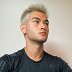
My name is Max Mondelli and I am an aspiring digital product designer. I am Swiss, Italian and Japanese. I graduated from Harvard University in 2018 before working in tech consulting in Silicon Valley for a year.
During lockdown, I decided on a career shift to UX/UI design and cannot wait to kickstart my design journey.
I would love to connect on Linkedin.
Thank you for making it this far, I hope you enjoyed reading about my process!